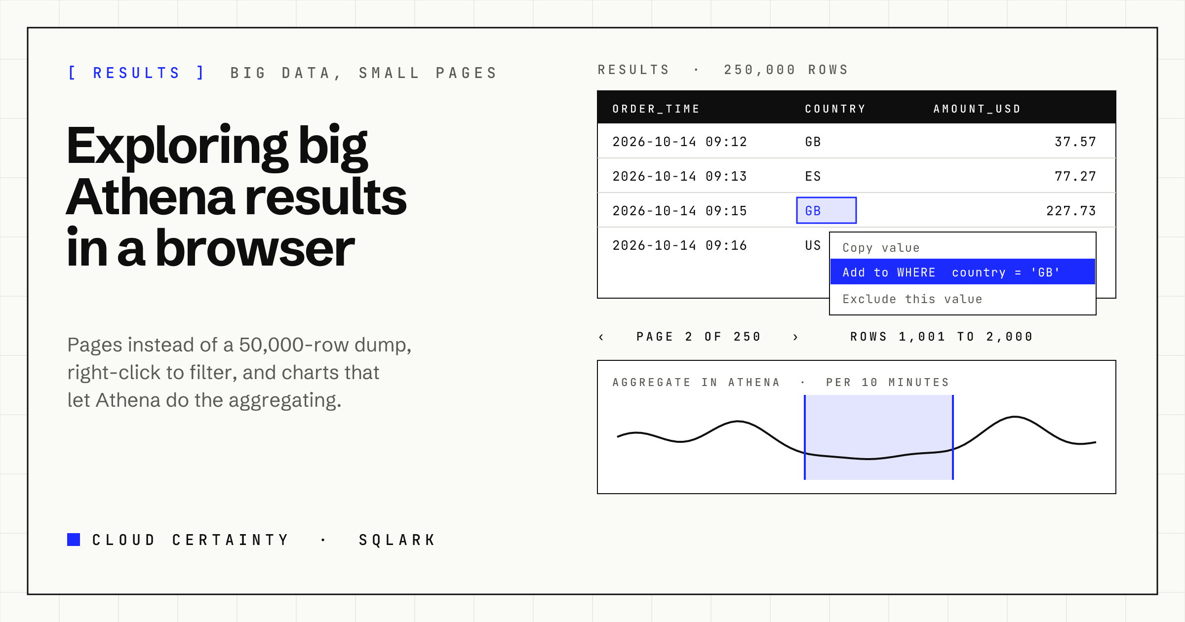
Athena is happy to return a few million rows. The tools around it are not. Download the CSV and your spreadsheet gives up; load it into a web page and the tab freezes. Most consoles quietly show you the first thousand or so rows and leave you to guess what the rest look like.
Big results need a different approach: look at them a page at a time, push filtering back into SQL, and chart them by asking Athena for an aggregate instead of drawing every row.
How Athena hands back results
Athena writes a query's full result to the workgroup's output location in S3 (or keeps it itself, for workgroups with managed query results (opens in a new tab)). Through the API, GetQueryResults (opens in a new tab) returns it in pages of at most 1,000 rows, every value as a string, with the column types alongside, and a token for the next page. The tokens only go forward.
So there are two ways to get at a result: the whole file from S3, or one page of a thousand rows at a time.
A page at a time
SQLark's results grid keeps one page in memory: 100, 500, 1,000 or 5,000 rows, as you choose. It shows "page N of M" and "rows X to Y of Z", taking the total from Athena's runtime statistics rather than counting rows in the browser.
Because Athena's tokens only go forward, SQLark keeps the token that starts each page you have seen. Going back is instant, and jumping to page 50 walks forward through the tokens with a progress bar you can cancel. The last few pages stay cached, so flicking between them doesn't call Athena again.
When you do want everything, Download CSV gives you the complete file Athena wrote, through a short-lived link, however large it is. You need the download permission for that.
Filters that know their limits
Search, sorting and the per-column filters (text, numbers, times and booleans, typed from the column's Athena type) work on the page on screen, and say so. Filtering one page of a quarter of a million rows is useful for a quick look, and misleading if you forget that's all it is.
Each of them offers Apply to the whole result in Athena. SQLark wraps your statement and runs it again:
SELECT * FROM (
  SELECT order_time, country, amount_usd FROM analytics.orders
) AS q
WHERE amount_usd > 100 AND country = 'GB'
ORDER BY amount_usd DESC NULLS LAST
The dialog shows that SQL and the estimated extra scan before it runs, because it is another query.
Right-click to add it to the WHERE clause
Most filtering starts with spotting a value: "only GB", "everything except cancelled orders", "these three customer ids". In SQLark you right-click the cell:
- Add to WHERE clause with
= value,<> value,> valueor< value, orIS NULLfor an empty cell. - Select several cells in a column with Ctrl or Shift, and add
IN (...). - Filter this page or Exclude this value, without touching the SQL.
SQLark edits the statement in the editor: it finds the outermost SELECT (the final one after a WITH), and either adds AND country = 'GB' to an existing WHERE or inserts a new WHERE before GROUP BY, ORDER BY or LIMIT. Literals are written for their type: 'it''s' for text, DATE '2026-10-14', TIMESTAMP '2026-10-14 09:30:00.000'. If the column is an alias or an expression, which can't go in a WHERE, it wraps the statement instead. The change is one undo step. Right-click a column header for Order by or Group by in Athena.
Charting the whole result, not the first page
A chart of the first thousand rows of a quarter of a million is a chart of the wrong data. SQLark picks one of two ways to draw it:
- Loaded rows. If the result has up to 50,000 rows, SQLark reads them all for the chart, separately from the grid, and draws them, thinning lines to a couple of points per pixel while keeping the peaks.
- Aggregate in Athena. Above that, the chart asks Athena for an aggregate of your statement, sized to about 1,000 points:
SELECT from_unixtime(floor(to_unixtime(order_time) / 86400) * 86400) AS order_time,
       sum(amount_usd) AS amount_usd
FROM (
  SELECT order_time, country, amount_usd FROM analytics.orders
) AS q
GROUP BY 1
ORDER BY 1
You choose the aggregate per value (sum, average, minimum, maximum, count). The chart shows the SQL, the estimated scan and the reuse setting, because this too is a query.
A time window you can move
For time-based charts, SQLark shows the window and an overview strip of the whole range. Drag across the chart to zoom in, or use Earlier, Later, Zoom in and Zoom out. With Aggregate in Athena, moving the window runs the aggregation again for that window with finer buckets, adding WHERE order_time BETWEEN ... so a week shows hourly detail and two years show daily totals.
If your statement already uses a time macro such as $__timeFilter (and better, $__partitionFilter), moving the window simply runs your statement for the new range. With a partition filter, that reads only the partitions in the window, which is the cheapest way to explore a big table over time.
Charts also guard against the usual traps: a series per value of an id column is never chosen automatically, at most eight series are drawn with the rest folded into "Other", and numbers on very different scales aren't squashed onto one axis.
In short
Look at big results a page at a time, let Athena do the filtering and aggregating, and keep the browser for the part people actually look at. That is how SQLark handles results of any size, in your own AWS account. See the SQLark page (opens in a new tab) for the demo.